 You may be asking yourself…“Why do I need a landing page? I have a great homepage!”
My quick response is: “You need both :)”
The reason is quite simple: landing page conversion rates are typically higher than homepage conversion rates.
This makes sense – traffic driven to your landing page is specific, whereas the direct traffic that lands on your homepage is diverse. And we all know when it comes to lead generation, the more specific the better!
To convince you a little more, if you run PPC, engage in social media or send out email marketing campaigns, you need to direct that traffic somewhere…and that somewhere is a brilliantly crafted landing page.
Okay, now you know you need one, let’s look at what makes a killer landing page.
How To Create a High Converting Landing Page
Create A Strong Layout
 You’ve heard it time and time again…first impressions count. The last thing you want is a visitor hitting the ‘Back’ button once they’ve arrived on your landing page.
Less is more here. Keep the page clean and simple. Your goal is to let a visitor move through the page as effortlessly as possible. To do this, ensure the page is free from clutter and has plenty of white space. This helps the visitor skim the content and move towards your call to action.
An easy way to confirm you’ve created a clutter free landing page is to check what’s visible above the fold (what you see before you start scrolling down).
A strong layout will have the following elements:
- A catchy headline
- A persuasive subheading
- A description of what you’re offering
- An image, graphic or video
- A call to action
Let’s explore these in a little more detail.
Write Concise Copy
George Orwell once said, “Never use a long word where a short one will do”.
 This is a golden rule when writing copy. Be concise yet relevant. Long rambling sentences and complex language simply puts people off.
Concise copy is easy to skim and easy to retain, that’s exactly what you want your visitors to do! Test this out on a friend or a colleague; if they struggle to read your copy, you’ve overdone it. Simplify your language and shorten your sentences.
Apply the same concept to the headline. It’s the first text your visitor sees so make it catchy. If you’re new to writing headlines, try using the “How To…” format; it’s an oldie but a goodie and works every time!
Finally, make sure your language is consistent throughout the whole conversion path. If your ad reads “Download A Free Guide Here”, your landing page must use the exact same language. If not, a visitor may think they’ve come to the wrong place and will hit the ‘Back’ button.
Convey Value
 Conveying value always stumps people. You may know the value of your services, but does anyone else?
How do you convey value to your customers?
By focusing on the benefits of your service/product and not the features.
A feature is a fact about a product or service. An example is cruise control on a car. But what’s the benefit of having cruise control? It gives your foot a break and makes highway driving more comfortable. Ultimately, the benefit of comfort is what people care about here, not the feature of cruise control.
An easy process to identify benefits is to make a list of your features. Then, for each one, ask yourself – why would anyone care about this? Use these questions to get you started:
- Why does this help them? Does it make them happier? Healthier? Less stressed?
- What sort of “pain” does this feature get rid of?
- How does this make someone’s life/job easier?
Include An Image Or Video
 Images are a great way to trigger emotion and forge a connection with minimal effort. Choose an image that shows what you’re offering or how it can be used.
Avoid stock images and clipart and instead opt for an image that helps the visitor visualise using your product or service.
If you choose a video, follow the same rule we discussed for copy. Keep it short and simple. You should be able to convey your offer, and its value, in one minute or less.
Remove Distractions
 Remember we talked about homepages having lower conversion rates than landing pages? Well, another reason for this is that they are full of distractions – a visitor can navigate to any number of pages from a homepage.
This is not the case with a landing page…
The objective of a landing page is to guide your visitor to a single call to action. A sure fire way to make that harder is to give your visitors more than one option!
The navigation bar at the top of a web page is a big distraction, so in a bid to focus your visitors’ attention, remove it from your landing page.
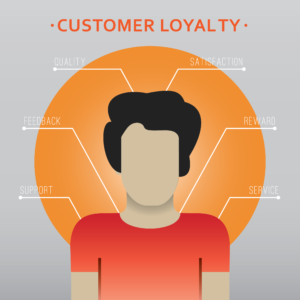
Back Up Your Offer With Testimonials
 The Internet is full of scams and empty offers. To weed out the bogus companies, consumers often rely on peer buy-in to guide their online decisions.
Think of Amazon and the power of customer reviews. Would you buy a product with a handful of 3 star reviews or one with hundreds of 5 star reviews? As an avid Amazon shopper, 5 star reviews win every time! Peer approval has a huge impact on consumer behaviour.
Reinforce credibility by including testimonials or client logos so visitors feel confident they’ve chosen the right company.
Include A Clear Call To Action
 Ah, the whole purpose of a landing page! A call to action.
Your call to action form should be distinctive and simple. Although it’s tempting, don’t go crazy and ask for a lot of information. Pare it down to just the information you actually need. There’s nothing more intimidating than a long form with unnecessary fields to fill out.
Pay attention to your language here – avoid using the word ‘Submit’ on your button. Choose a word or phrase that appeals to the visitor such as ‘Download Your Guide Now’ or ‘Access Free Demo’. After all, that’s what enticed them here in the first place, right??
A Way To Contact You
 Does your company really exist?
The only acceptable distraction on a landing page is contact information. Contact information, like testimonials, inspires confidence. It should be placed discretely on the landing page and should include your phone number, address and a way to reach you.
If you’re a big operation, ‘Live Chat’ is a great tool. If a customer is unsure, this is an easy way to connect with them and overcome any hesitation.
So there you have it, a clear guide to creating a high converting landing page! Seems manageable right? Leave a comment or question below and let us know how you get on. Did we miss a crucial feature? Let us know!
Join our PPC Academy and to get access to dozens of tutorials, webinars and master classes.