In the podcast:
00:37 – Introduction
01:21 – What is Google Display Network(GDN)
03:37 – Ad unit size: 300×250
04:26 – Ad unit size: 728×90
05:01 – Ad unit size: 160×600
05:27 – Ad unit size: Other types
06:36 – Extra Bonus Tip
08:00 – Wrap-up
Welcome to a quick tip episode, where is share quick traffic generating tips with you. In today’s episode I talk about the most commonly used banner ad unit sizes (for the Google Display Network) which you should focus on. I also cover which ad unit sizes are not worth focusing on, so you can save money on graphic design costs. I also share a special bonus tip on how we test banner ads in our digital agency, Green Arrow Digital. Enjoy!
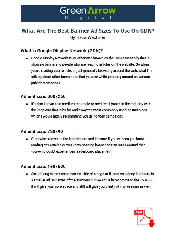
What Are The Best Banner Ad Sizes To Use On GDN? in PDF

Ilana: Alright welcome back to Teach Traffic and today we’re doing something a little bit different. We’re doing a quick tip episode and I’m going to be running these each and every week. So these quick tip episodes are where I going to be sharing some really short traffic tips with you each and every week that relates to Google ads, Facebook ads, or really any kind of website traffic generating strategy paid or organic. So for our first quick tip episode, I’m going to talk about Google display ad banner sizes. And really the main ad unit sizes you really only need to worry about And importantly, the ones you don’t. So let’s jump right in today’s episode.
What is Google Display Network (GDN)
Ilana: What’s going on my friends Ilana Wechsler here from Teach Traffic. And as mentioned in the intro, in this quick tip episode, we’re going to be talking about Google banner ad unit sizes on the Google Display Network. So if you’re unfamiliar what the Google Display Network is, or otherwise known as the GDN essentially that is showing banners to people who are reading articles on the website. So for our American listeners, it might be reading an article on the New York Times or as Australian listeners and might be the Sydney Morning Herald, for example. So when you’re reading your article, or just generally browsing around the web, what I’m talking about are the banner ads that you see while perusing around on various publisher websites. So many people do this form of advertising, especially through the remarketing campaigns where people have come to their website before and therefore their banner ads are following them around as awful as that sounds.
And so therefore, if you are doing this, then you no doubt have had to select and create some ad unit sizes to implement in your account. So that’s what we’re talking about today. Now, as you probably know, there are a bunch of different ad unit sizes that you can run and it’s quite overwhelming when you know, read the Google help article and see all the multitude of different banner ad unit sizes that you can run and if you’ve hired a graphic designer, you know that the costs certainly add up pretty quickly when you start factoring in different headlines, you might want to test and different designs, roll that out across all the different ad unit sizes, and suddenly you’ve racked up lots and lots of graphic design costs. So today’s episode is really just to highlight which ad unit sizes of the most important ones to focus on. And equally important, which ones I wouldn’t even bother wasting your time getting an ad unit size created on so you can save that money and use that money elsewhere. Hopefully on spending more money on ads, right. So that’s why this is really important.
Ad unit size: 300×250
Ilana: So let’s go through some of these commonly used main ad unit sizes that I would highly recommend that you use and the first is by far and away the most commonly used ad unit size which is 300×250. So 300 pixels by 250 pixels. And they always mentioned the width of the pic of the banner size first so 300 pixels across all the width by 250 pixels vertically okay so it’s also known as a medium rectangle or med rec if you’re in the industry with the lingo and that is by far and away the most commonly used ad unit sizes which I would highly recommend you using your campaigns.
Ad unit size: 728×90
Ilana: The next commonly used one is 728×90 so 728 pixels across by 90 pixels down this is also other way otherwise known as the leader board and I’m sure if you’ve been you know reading any articles or you know noticing banner ad unit sizes around then you’ve no doubt experiences leader board placement as it is a very commonly used ad placement. So that’s another one that we definitely recommend you use.
Ad unit size: 160×600
Ilana: Another common one I also recommend you use is 160×600. So that’s sort of this sort of long skinny one down the side of a page or it’s not so skinny, but there is a smaller ad unit sizes of the 120×600 but we actually recommend the 160×600 it will give you more space and still will give you plenty of impressions as well.
Ad unit size: Other types
Ilana: All right, if you are running a sort of an optimized mobile campaign as well. You might also want to try a mobile banner ad unit size of 320×50. Alright, so there are a whole bunch of other banner ad unit sizes that you may see floating around by like 468×60, as I mentioned the 120×600 and then 970×90 and square ones of 200×200. Honestly, I haven’t actually worked it out. But I think they must be up to like 25 or 30 different banner ad unit sizes. So you can imagine how expensive those costs can rack up to be when you start rolling all those different ad unit sizes out, as well as multiplying that across all the different elements that you might be testing. So we are all about spending our money wisely. So we only really test those three to four main ad unit sizes first, and then we will test those first before even we start even considering any other ad unit sizes.
Extra Bonus Tip
Ilana: I have an extra bonus tip for you on this is when you are testing different messaging, creative, and design elements in your banners. I would do all your different variations in one ad unit size first. So take the 300×250 or med rec banners size, create all your variation that you want to test in just that one ad unit size. So you might even have up to 12 different variations of the 300×250 ad unit size with you know the different headlines and design etc. roll those different banner ad unit sizes first and then once you’ve got the winning top two to three winners in that ad unit size, then roll that messaging and creative at into the other sizes that we have suggested on today’s episode. And this will further conserve some of your costs. But also it will eliminate the variability of I guess ad unit size being a factoring click through rate and conversion rate, etc. So for a proper test, pick one of the ad unit sizes first roll them out in all their different variations. And then when you get the winners then you can roll out in some for the ad unit sizes.
Ilana: So they have our quick tip episode. I hope you found this helpful. If you like this kind of episode I’d love for you to let me know you can leave a review on iTunes or you can even let me know personally however you decide to get in contact with me that’s totally fine. We’re going to make some show notes available for this episode. So you can head on over to TalkingWebMarketing.com that actually does redirect you to the podcast section of my website called GreenArrowDigital.com and we’re going to make some show notes available for you so that you can download these ad unit sizes and you don’t have to frantically write them down and remember them because I can imagine it is pretty confusing of what was that number and you know, is it 250×300 or 300×250, etc. So not to worry we’ll make a resource available to you for you to download and stay tuned for more episodes like this talk to you soon.


